
In today’s increasingly inclusive society, accessibility is more important than ever. One of the critical ways we can promote inclusivity in public spaces is through accessible wayfinding signage. Clear and intuitive signage not only aids in navigation but also ensures that people of all abilities can move comfortably and confidently through any environment. From airports and shopping centres to hospitals and schools, accessible signage is vital in making these spaces open to everyone.
Designing wayfinding signage that meets the needs of individuals with disabilities involves careful consideration of multiple factors, including visual impairments, mobility issues, and cognitive disabilities. In this article, we will explore the importance of creating accessible wayfinding signage and share practical tips for designing signs that promote inclusivity for all.
Why Accessible Wayfinding Signage Matters
Wayfinding signage serves one fundamental purpose: to help people find their way. For many people, navigating through a building or outdoor space is a straightforward task. However, for individuals with disabilities, this can be significantly more challenging. Those with visual impairments may struggle to read conventional signs, while people with mobility issues may find it difficult to access poorly located signs. Others, such as those with cognitive impairments, might need extra clarity and simplicity in the design to understand directions.
When signage is not designed with accessibility in mind, it can lead to confusion, frustration, and exclusion. However, by incorporating accessible design principles, businesses and public institutions can create spaces that are welcoming to everyone, regardless of their abilities. This not only enhances the visitor experience but also complies with legal requirements, such as the Equality Act 2010 in the UK, which mandates equal access to services and public spaces.
Key Elements of Accessible Wayfinding Signage
Creating accessible wayfinding signage requires an understanding of various impairments and how they affect a person’s ability to interact with the environment. Below are the key elements to consider when designing inclusive signage.
1. Braille and Tactile Signs
For people with visual impairments, tactile signage that includes braille is essential. Braille signs enable blind or partially sighted individuals to independently navigate through spaces. These should be placed at a height and location that is easy to reach and positioned where a person would expect to find them, such as next to doors or in lift lobbies.
When creating braille signage:
- Use Grade 1 braille (which represents the alphabet and punctuation) to ensure ease of reading.
- The braille should be raised at least 0.7 mm from the surface and be located below the text on the sign.
- Signs should be installed at a height that is accessible to wheelchair users, generally around 1.4 to 1.7 metres from the floor.
2. High-Contrast Colours
Colour contrast is one of the most critical factors for people with low vision. High-contrast signage helps those with limited sight to differentiate between the text and the background, making information clearer and easier to read.
To achieve high contrast:
- Use contrasting colours between the text and the background. For instance, black text on a white or yellow background works well.
- Avoid using light text on a light background or dark text on a dark background, as this makes the text harder to distinguish.
- Avoid colour combinations that may be challenging for colour-blind individuals, such as red and green. Instead, use combinations that are universally easy to see, like blue and white.
3. Legible Fonts
The choice of font plays a vital role in making signage accessible. Fonts that are too small, overly ornate, or condensed can be difficult to read, especially for people with visual impairments.
For accessible wayfinding signage:
- Use a sans-serif font, such as Arial or Helvetica, as these are generally easier to read than serif fonts.
- Ensure the font size is large enough to be legible from a distance. A general rule is that for every metre of distance, the letter height should be at least 15 mm.
- Avoid all caps for long sections of text, as this can make reading more difficult. Use mixed-case letters instead, with sentence case being ideal for signage.
4. Clear and Simple Language
For individuals with cognitive disabilities or non-native speakers, the language used on signage needs to be straightforward and easy to understand. Overly complex wording or technical jargon can create unnecessary confusion.
To enhance readability:
- Use short, concise sentences that convey the necessary information clearly.
- Avoid using abbreviations or acronyms unless they are universally understood.
- Where possible, complement text with clear, universally recognised symbols or icons to reinforce the message.
5. Appropriate Sign Placement
It’s not enough for signage to be accessible in design; it must also be placed in locations where it can be easily seen and used by everyone, including people with mobility challenges.
When placing accessible signage:
- Ensure signs are installed at heights that are accessible to both standing users and those in wheelchairs. This typically means placing signs between 1.2 and 1.7 metres from the ground.
- Signs should be placed in well-lit areas where they are easily visible, and glare from light sources should be avoided to prevent readability issues.
- Directional signs should be placed at key decision points, such as at the entrance to a corridor or at the top and bottom of stairs.
The Role of Technology in Accessible Wayfinding
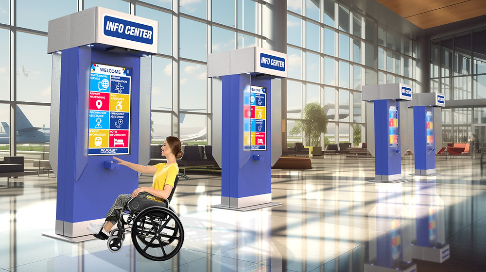
In addition to physical signage, many modern spaces are integrating technology to improve accessibility. Digital wayfinding solutions, such as interactive kiosks, mobile apps, and QR codes, can provide additional guidance to those with disabilities.
For example:
- Mobile Wayfinding Apps: These apps can offer voice-guided navigation for individuals with visual impairments, helping them move through spaces more easily.
- QR Codes: Scanning a QR code on a sign can provide additional information or even an audio description, enhancing the accessibility of static signage.
- Interactive Kiosks: These can be designed with both visual and audio options, allowing users to select the method that works best for them.
For wider commercial, hospitality, or public-facing projects, small supporting details can make the finished space feel more complete. Composite decking can provide a durable, low-maintenance surface for terraces, entrances, outdoor seating areas, and customer-facing spaces; while hand dryers can support cleaner, more efficient washroom facilities; while traditional signage can add character, direction, and brand presence; while digital signage can share changing information, promotions, menus, or wayfinding updates clearly.
Conclusion
Creating accessible wayfinding signage is not just about complying with regulations; it’s about fostering an inclusive environment where everyone feels comfortable and empowered to navigate public spaces independently. By incorporating features such as braille, high-contrast colours, legible fonts, and intuitive design, businesses and public institutions can make their spaces more welcoming to all visitors, regardless of their abilities. Through thoughtful design and placement, accessible wayfinding signage plays a crucial role in promoting inclusivity and enhancing the overall user experience.